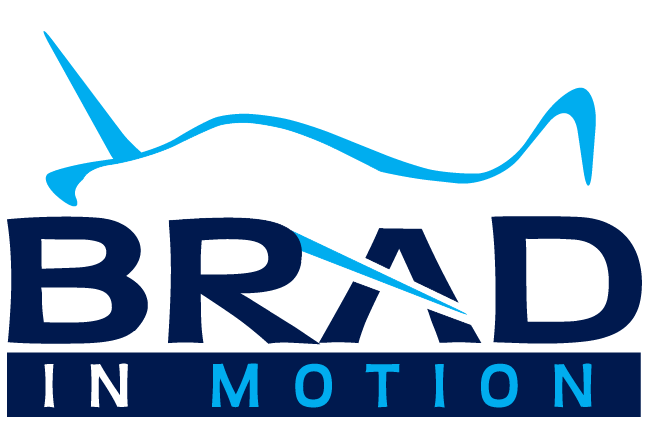
Brand New Brad in Motion Logo!
I’m thrilled to present my brand new Brad in Motion logo! Brad in Motion is the personal brand I utilize both in online platforms as well as in my various speaking engagements. I’ve wanted a more modern, fluid, forward looking logo for a long time and it’s finally come to fruition. I worked with my fabulous graphic design artist, Ramona, who worked her magic to create it for me. It was a collaborative effort as I shared my vision which she executed flawlessly.
The design premise was the desire to have a logo that was simple, while still employing creative artistic elements. The fluid ribbon component of the airplane silhouette was intentional by design to signify motion. The bold lettering, mixed with a dark/light color composition makes the image appear authoritative, yet not overbearing. The blue color scheme pays tribute to my passion for soaring high in the sky above. The diagonal flow of the light blue coloring further enhances the sense of forward motion. The cross-cut airplane wing element which creates the letter A in the word BRAD adds both creativity as well as merging the graphical and text components into one integrated image.
I’m totally ecstatic about my new Brad in Motion logo and feel it’s absolutely perfect. I’m proud of the progressive image it represents which exemplifies the positive, modern, forward thinking brand I want to project to the world!


No Comments